Blowfish
A Japanese quick service restaurant housed within Canberra’s Tiger Lane precinct, serving up sushi rolls + ricebowls.
Offering fresh, flavourful poké bowls and a variety of hand rolls that put a distinctive Australian spin on the classic Japanese dish, Blowfish is the ideal spot for those who crave bold flavours and inventive cuisine.
Scope
-
Logo, Branding
-
Takeaway Packaging, External Posters
-
Exterior Signage, External Posters, Lightbox Menu Display
Our Vision
At the heart of the branding is a whimsical blowfish icon, symbolising the brand’s fun, quirky personality. This icon takes centre stage in the storefront signage, with a giant inflatable blowfish drawing in curious diners. This design approach aligns with the Tiger Lane precinct branding, where each venue incorporates a unique animal icon, fostering a sense of individuality while maintaining precinct cohesion.
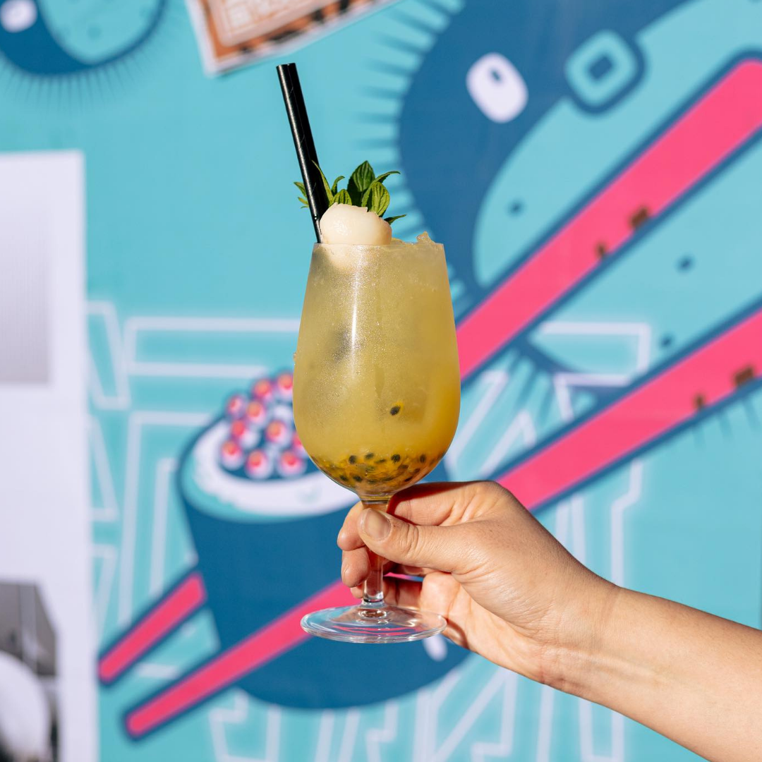
The visual identity is vibrant and modern, with a primary colour palette of bright blue and pink. These hues evoke the freshness and tropical energy associated with Hawaii and Japan, the key inspirations behind the menu. Playful typography further enhances the brand's approachable and lively character, making it as visually appealing as the dishes themselves.
From the neon-lit signage to the dynamic use of colour and quirky iconography, Blowfish creates a dining experience that’s as bold and memorable as its menu.

![[image] - 6930980.jpeg](https://images.squarespace-cdn.com/content/v1/659b23d04fd834744a24fb27/1736141365853-H39GQS1QHJFZXEHAO1JN/%5Bimage%5D+-+6930980.jpeg)

![[image] - 4829251.jpeg](https://images.squarespace-cdn.com/content/v1/659b23d04fd834744a24fb27/1736141366831-KXD5YJ5T6HBLFXN256H2/%5Bimage%5D+-+4829251.jpeg)


![[image] - 8813215.jpeg](https://images.squarespace-cdn.com/content/v1/659b23d04fd834744a24fb27/1736141368182-B92EGRQ9C1UEZ5TNHBOX/%5Bimage%5D+-+8813215.jpeg)

![[image] - 9290676.jpeg](https://images.squarespace-cdn.com/content/v1/659b23d04fd834744a24fb27/1736141373147-1CV20W39303IUW2R5LSV/%5Bimage%5D+-+9290676.jpeg)