Casa Esquina
At Casa Esquina, fiery Argentine spirit flickers through every dish, coaxing deep, earthy flavour, from every ingredient.
Uncover an unexpected culinary heritage enriched by European influences, where the fun of discovery is intertwined with the dining experience.
We are artisans of abundance, sharing the joy of food, laughter, and connection over plates that spill from hearth to heart. Whether a casual escape or a grand celebration, experience the warmth of Argentinian fire. Experience Casa Esquina.
Scope
-
Logo, Brand Guidelines, Photography Styling Guide
-
Brand Persona, Tone of Voice Guidelines, Messaging Pillars, Website Copy
-
Menu Design, Digital Assets, Signage
-
Design & Build of multi-page Squarespace website.
Our Vision
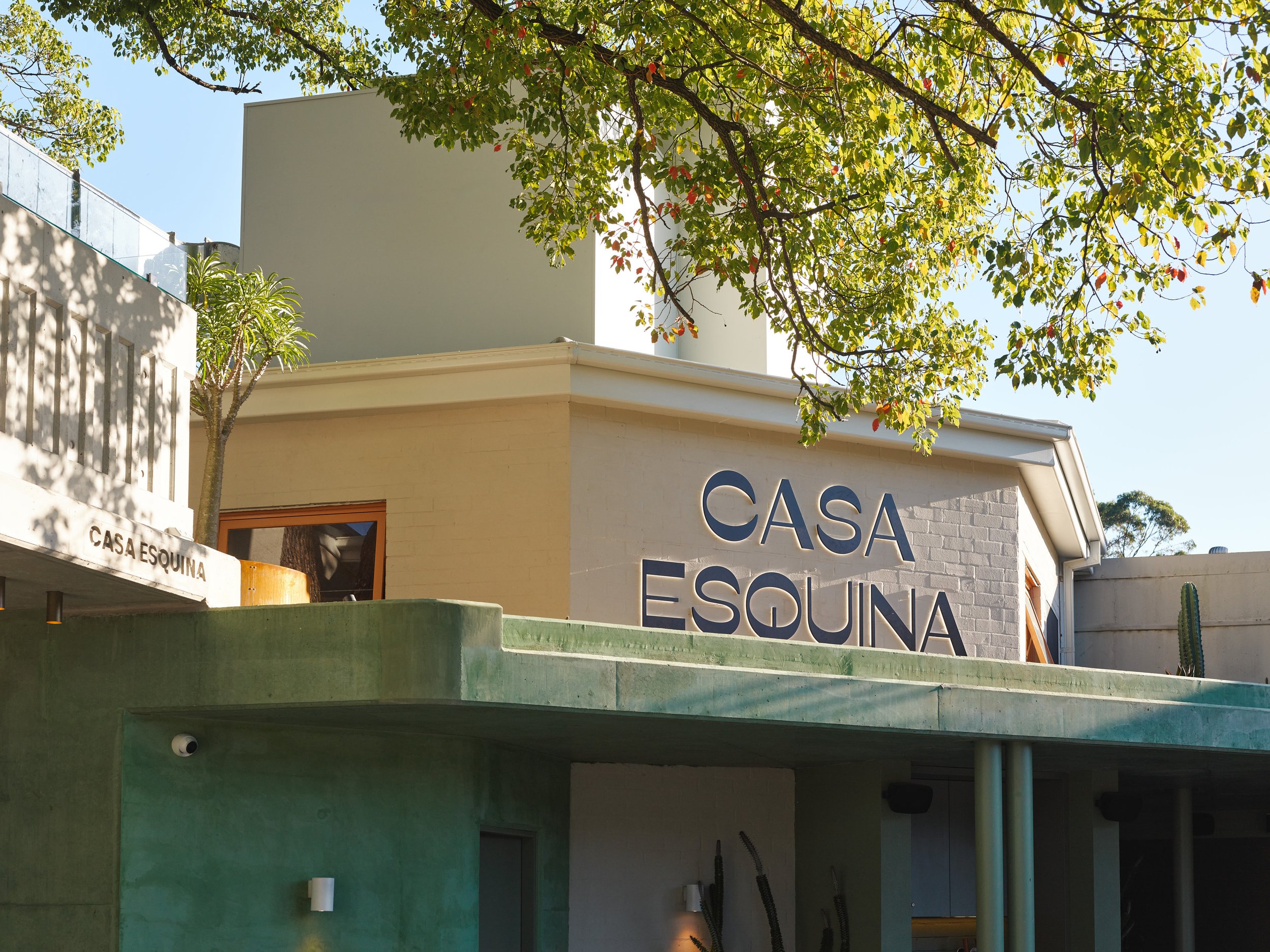
The logo design draws inspiration from the charming rounded arches that are a hallmark of the space—from the arched windows on the Level One terrace to the softly curved door frames and corners throughout the interior. These elements create a sense of flow and harmony, evoking the warm, welcoming feel of a true "Casa."
The welcoming door imagery reinforces the concept of "Casa"—a home, a place of warmth and hospitality. The tree motif in the design pays homage to the tree that grows through the balcony, a natural and unique feature of the space.
Casa Esquina already had a preferred font and colour palette, which we refined into a cohesive visual brand identity that captures the essence of the venue, incorporating organic earthy textures and movement.
The typeface, 'Ribes,' evokes a 1950s aesthetic, reminiscent of a time when steakhouses and fine dining reigned supreme, adding a touch of nostalgic elegance to the brand. The colour palette, composed of muted retro tones, enhances this vintage feel and is echoed in the venue's interior design, ensuring a seamless and immersive brand experience.


