San Pancho
Takeaway Mexican Street Taqueria
Inspired by time-honoured recipes of Abuela Lolita's street-side fonda, San Pancho is a love letter to Mexican heritage, cuisine and culture.
The menu celebrates owner, Roberto’s Mexican heritage, championing the dishes, ingredients and flavours that he was raised on. Discover unfamiliar favourites like Chilaquiles - say it out loud, (chee-lah-KEE-lehs) wasn't that fun? This distant cousin of the humble nacho is one of their signatures. You'll also find tacos, tostadas, enchiladas and fiesta combo feasts, each one lavishly served and made fresh to order.
Scope
-
Logo, Brand Guidelines, Photography Styling Guide
-
Brand Persona, Tone of Voice Guidelines, Messaging Pillars, Website Copy
-
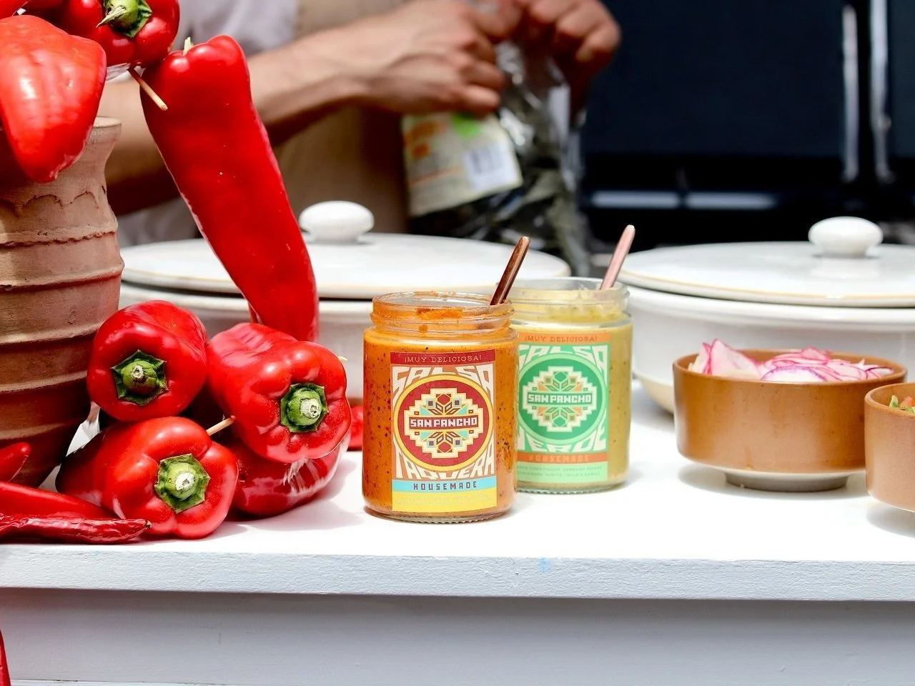
Digital Menu Design, Takeaway packaging (Greaseproof Paper, TA Bags, Stickers, Salsa, and Drinks Labels)
-
Design & Build of multi-page Squarespace website.
Our Vision
San Pancho's visual brand identity celebrates vibrant Mexican culture through a unique blend of textures and colours. The logo, inspired by Huichol beadwork, utilises warm colours that nod to both Mexican tradition and a rustic, retro aesthetic.
This vibrancy is balanced by organic textures like recycled paper and worn accents, reflecting authenticity.
The font choices mirror this theme – hand-drawn elements in the headings evoke Mexican street vendors, while clear and easy-to-read body text ensures a smooth brand experience. Overall, San Pancho's branding aims to be a fast, casual, and inviting space that transports customers to the heart of Mexico through both delicious food and a thoughtfully designed environment.


![[image] - 9522441.jpeg](https://images.squarespace-cdn.com/content/v1/659b23d04fd834744a24fb27/1736138877853-DXB1AFDN9EYOGGGC5YWZ/%5Bimage%5D+-+9522441.jpeg)


![[image] - 1205183.jpeg](https://images.squarespace-cdn.com/content/v1/659b23d04fd834744a24fb27/1736139203302-P4N0YS22729TR2P1UM8G/%5Bimage%5D+-+1205183.jpeg)