Sticky Beak
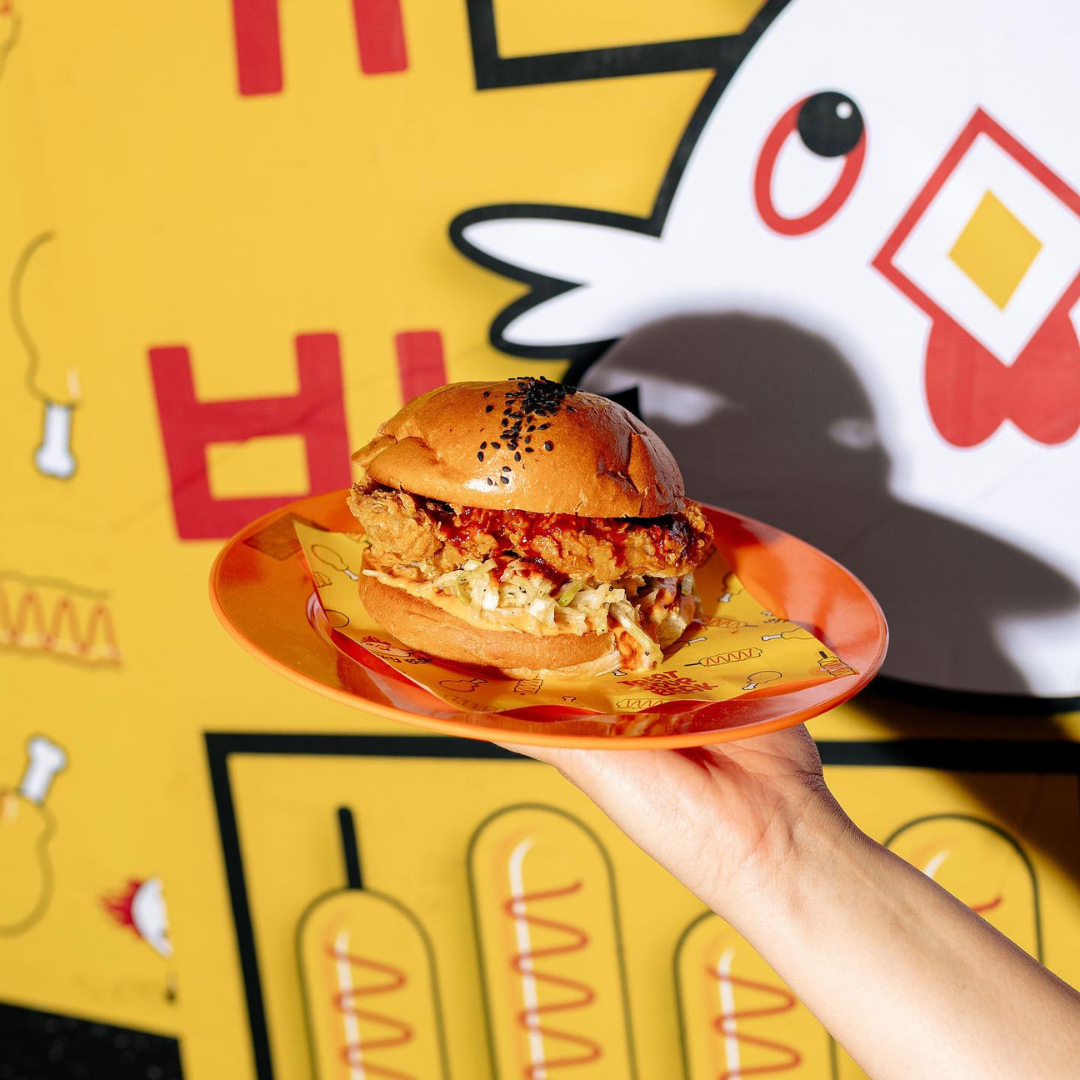
Sticky Beak is a Korean street food-inspired quick-service restaurant housed within Canberra’s newest dining precinct, Tiger Lane.
Sink your teeth into succulent pieces of crispy, Korean fried chicken, coated in a mouth-watering blend of spices, or indulge in a sizzling hot dog on a stick, dipped in your choice of batter and deep-fried to perfection.
Scope
-
Logo, Visual Brand Identity
-
Takeaway Packaging, External Posters
-
Exterior Signage, External Posters, Lightbox Menu Display
Our Vision
The branding encapsulates a cheeky and playful personality, featuring a fiery-crested chicken icon that embodies Sticky Beak’s vibrant energy. This design ties into the broader Tiger Lane precinct branding, where each venue is represented by a unique animal icon, creating a cohesive yet distinctive identity.
The brand’s colour palette—yellow, black, and red—is bold, vibrant, and undeniably fun, evoking the excitement of a bustling Korean street food market. Typography blends a playful, dynamic font with clean, modern Korean characters, reflecting the fusion of traditional and contemporary influences.
Sticky Beak’s visual identity perfectly balances whimsy and practicality, delivering a cohesive brand experience that stands out in the fast-paced, high-energy environment of Tiger Lane. With every bite and every glance, Sticky Beak promises a dining adventure that’s just as bold and exciting as its personality.


![[image] - 8110528.jpeg](https://images.squarespace-cdn.com/content/v1/659b23d04fd834744a24fb27/1736141798136-O3Y8OBJXI509RDEMIOXA/%5Bimage%5D+-+8110528.jpeg)


![[image] - 4112528.jpeg](https://images.squarespace-cdn.com/content/v1/659b23d04fd834744a24fb27/1736141796214-EMSGJ6V5KK3TJG99G8SH/%5Bimage%5D+-+4112528.jpeg)